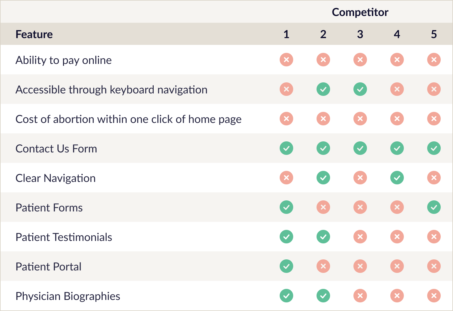
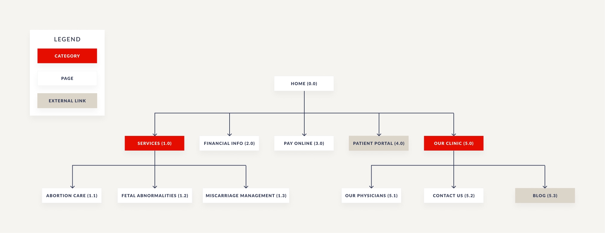
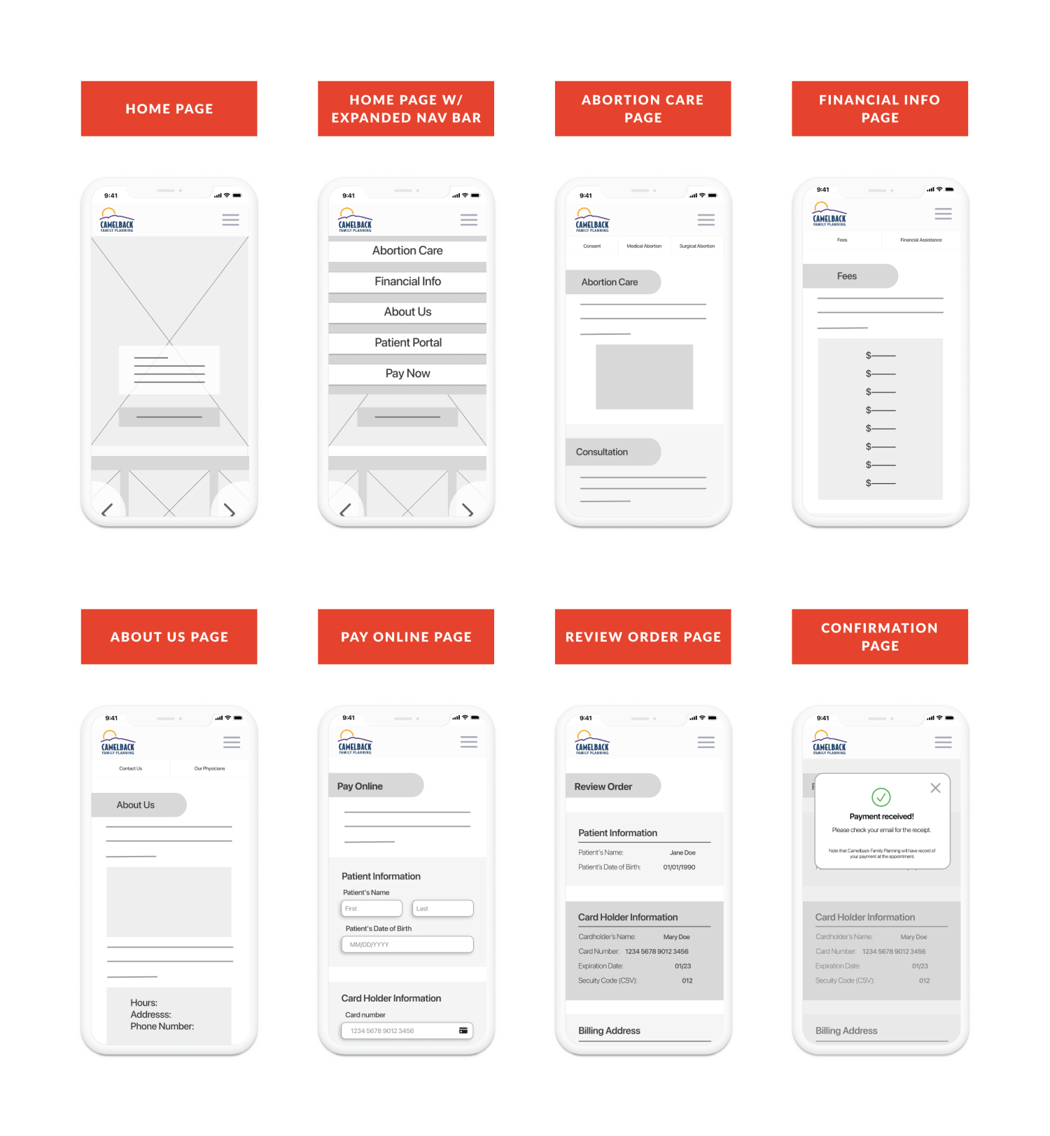
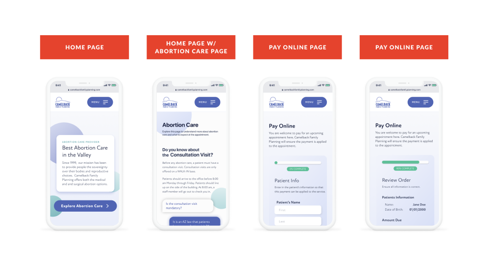
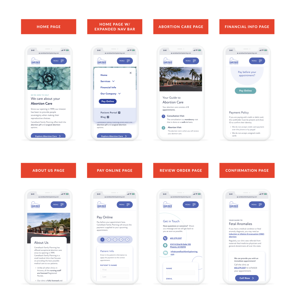
The following are some (not all) examples of the changes made to the site to improve the user experience.
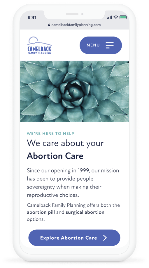
the home page
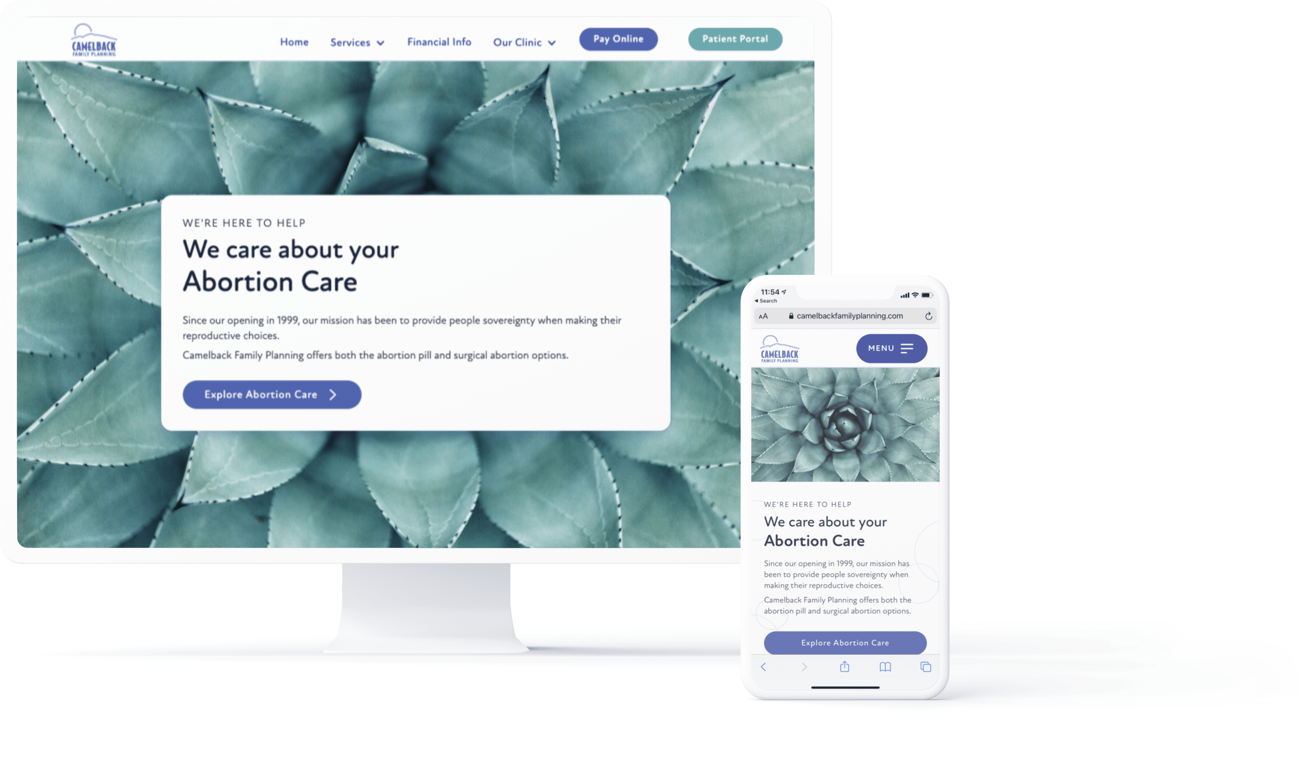
To increase accessibility to abortion care, my main goal was to make finding information on abortion care easier. This all started with the home page. Prior to the redesign, the home page lacked a clear call-to-action (CTA), had disjointed navigation, and lacked purposeful content.
In the redesign, clear CTAs were added to allow different end-users quick access to the desired information; the overall navigation of the site was condensed and made available via the main navigation bar; and lastly, a photo gallery, testimonials section, and contact us form were added to help instill confidence in the site and help answer initial questions.
the our physicians page
Previously, the Our Physicians page was not accessible from the home page. Additionally, the content was outdated, and the page only focused on one of five physicians working at the clinic.
Now, the Our Physicians page highlights all five doctors, is easily accessible through the main navigation bar, and the main reasons to go to the clinic are highlighted in a way that is easily absorbable.
Previous Our Physicians Page
Current Our Physicians Page
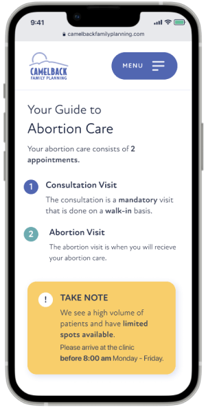
the Abortion care page
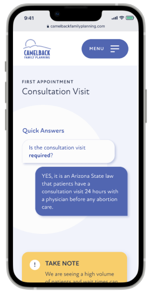
Previously, the information relevant to abortion care was spread across four pages. This caused users to misunderstand the abortion care process and, in many cases, miss critical information regarding the consultation visit.
In the redesign, I wanted to ensure the consultation visit information would be seen. To do this, it was placed at the top of the page and emphasized with various principles of hierarchy. Additionally, all the information relevant to abortion care was combined into one main page. By implementing expandable text boxes, the user was able to scroll through the information with ease and interact with elements that sparked curiosity.
Previous Abortion Care Page
Current Abortion Care Page
the financial info page
Before, the information on fees and financial assistance was not accessible via the main navigation, and the content was wordy and lacked hierarchy. This made it difficult for users to find the information they were looking for.
In the redesign, information pertaining to finances was grouped onto one page and the information was condensed. This allows users to quickly scan the content and find critical information quickly.
Previous Financial Info Page
Current Financial Info Page


.svg)


.svg)